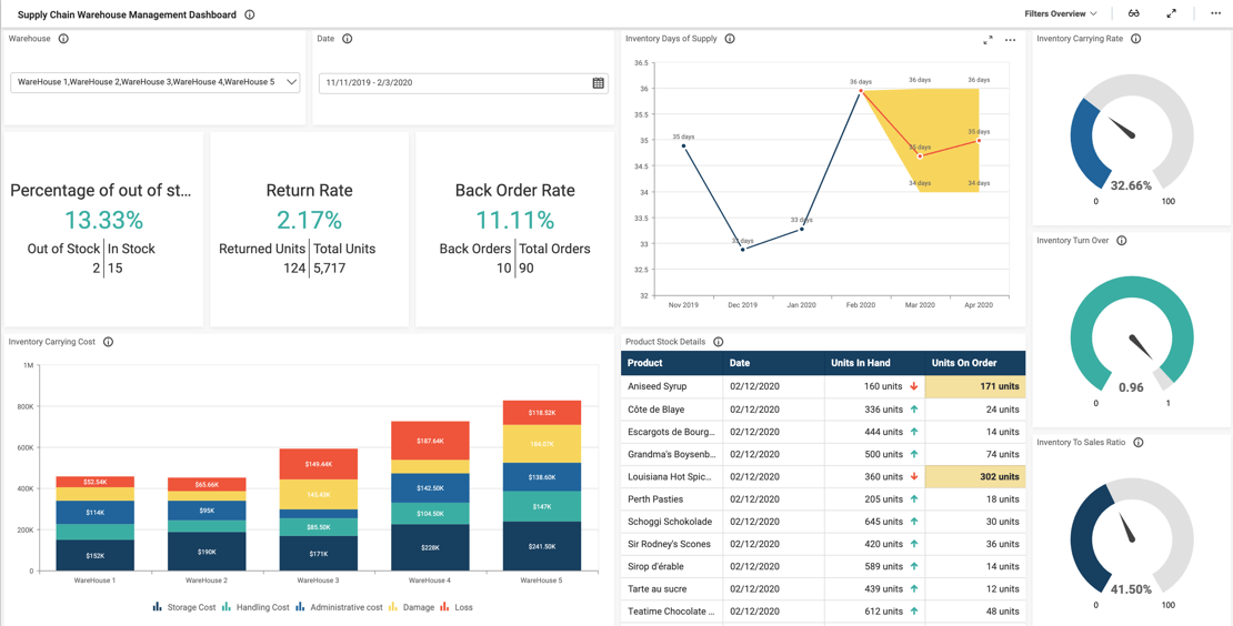
- Firstly, what is our perfect order rate?
- Secondly, how many orders were delivered on time?
- How long does it take us to convert inventory and expenses into cash?
- Finally, are customers happy with our service?
With this supply chain performance dashboard, viewers can gain a deeper understanding of the company’s operations.
Track Order Details and Filter Your Data
First, with the Orders Count by County map, users can view a quick snapshot of each order’s details (such as the customer’s city, product name, and delivery status).
Additionally, the Product Order Details chart outlines which products were ordered, how many units were purchased, and the total amount of each order.
The Cash to Cash Cycle Time graph illustrates how long it takes the company to convert its inventory and other expenses into cash from sales. The Days Receivable, Payable, and Inventory Outstanding cards provide further insight into the company’s financial and sales operations. These metrics give leaders helpful insight into the company’s overall performance and efficiency.
It is also worth noting that viewers can filter data by using the “Order Status” and “Order Date” drop-down list boxes. With these filters, viewers can choose to view data for any combination of dates and order statuses. For instance, users could view information for delayed and on hold orders for the first week of December. Similarly, they could view data solely for orders that were delivered on December 3.
Users can reset these filters by clicking the funnel-shaped icons in the upper right corners of the drop-down list boxes. If both filters are reset so that specific order statuses and dates are not selected, we will see the overall numbers.
Ensure Customer Satisfaction
Finally, widgets such as the Perfect Order Rate gauge, On Time Delivery card, and Feedback Details chart offer insight into customer satisfaction and whether there are areas where the company could improve its service.


