- What is our velocity?
- How many planned story points do we have? Conversely, how many story points did we add?
- What are the statuses of our tasks?
- Finally, what are our high priority incomplete tasks?
Track Tasks by Type, Status, and Priority
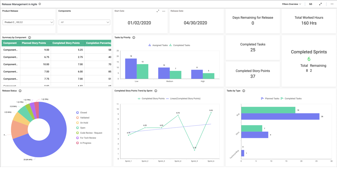
With the card widgets at the top of the dashboard, we can easily track the total hours worked, story points, and tasks. Then, we can review the three bar charts below the cards to gain additional insight into the team’s progress.
First, the sprint velocity chart displays the number of planned and completed story points. Next, the scope changes widget details the number of planned, added, and removed story points. Finally, the tasks widget illustrates how many planned and completed bugs, stories, and blogs are on the team’s agenda. This information is crucial as it offers key insight into the team’s performance and the value they bring to their business. Moreover, tracking this data over time can help the team improve its project planning.
It is also worth noting that the completed story points spline chart tracks the number of story points the team completed each day. Finally, the tasks pie chart displays the percentage of tasks in each status while the incomplete tasks tree map displays the number of outstanding tasks for each project, along with their priority levels.
Filter Your Data
One key feature of this dashboard is its versatility. With the “Project” and “Sprint” drop-down list box filters, viewers can display data for any combination of projects and sprints. Users can reset a filter by clicking the funnel-shaped icon in the upper right corner of the list box. This feature is invaluable for users who need to focus their analysis on specific pieces of data.


